
Farrow & Ball's 2025 kitchen cabinet palette features dramatic Etruscan Red for statement pieces, tranquil greens like Dibber and Sap Green for natural harmony, and earthy neutrals including Naperon terracotta for warmth. You'll find moody designs with Douter's grey-green depths and bold options like Marmelo's burnt orange. Consider your kitchen's lighting—north-facing spaces benefit from warmer tones while south-facing rooms shine with cooler shades. The perfect shade awaits within this sophisticated collection.
- Article Highlights
- Kitchen Cabinets Repainting Farrow and Ball Colour Choices for 2025
- The Evolution of Kitchen Cabinet Colours in 2025
- Scallop: Adding Warm Nostalgia to Culinary Spaces
- Dibber: Bringing Nature's Tranquility to Kitchen Cabinetry
- Douter: Creating Dramatic Depth in Contemporary Kitchens
- Reduced Green: Earth-Inspired Elegance for Cabinet Transformations
- Sap Green: Vibrant Olive Tones for Statement Kitchens
- Etruscan Red: Sophisticated Warmth for Heritage Kitchen Designs
- Naperon: Terracotta Richness for Mediterranean-Inspired Cabinets
- Marmelo: Spiced Orange Accents for Kitchen Focal Points
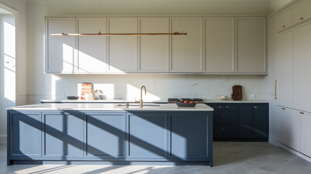
- Kakelugn: Scandinavian Blue Serenity for Modern Kitchens
- Pairing Cabinet Colours With Complementary Wall Treatments
- Colour Psychology: How Cabinet Hues Affect Kitchen Ambiance
- Light Considerations: Choosing Colours Based on Kitchen Orientation
- Two-Tone Cabinet Strategies Using Farrow & Ball's 2025 Palette
- Island Focus: Creating Statement Pieces With Bold Colour Choices
- Small Kitchen Transformations With Strategic Colour Application
- Open-Concept Considerations for Cabinet Colour Selection
- Maintaining Colour Integrity: Finishes and Protective Treatments
- Budget-Friendly Approaches to Cabinet Repainting Projects
- Frequently Asked Questions
- Conclusion
- Article Highlights
- Kitchen Cabinets Repainting Farrow and Ball Colour Choices for 2025
- The Evolution of Kitchen Cabinet Colours in 2025
- Scallop: Adding Warm Nostalgia to Culinary Spaces
- Dibber: Bringing Nature's Tranquility to Kitchen Cabinetry
- Douter: Creating Dramatic Depth in Contemporary Kitchens
- Reduced Green: Earth-Inspired Elegance for Cabinet Transformations
- Sap Green: Vibrant Olive Tones for Statement Kitchens
- Etruscan Red: Sophisticated Warmth for Heritage Kitchen Designs
- Naperon: Terracotta Richness for Mediterranean-Inspired Cabinets
- Marmelo: Spiced Orange Accents for Kitchen Focal Points
- Kakelugn: Scandinavian Blue Serenity for Modern Kitchens
- Pairing Cabinet Colours With Complementary Wall Treatments
- Colour Psychology: How Cabinet Hues Affect Kitchen Ambiance
- Light Considerations: Choosing Colours Based on Kitchen Orientation
- Two-Tone Cabinet Strategies Using Farrow & Ball's 2025 Palette
- Island Focus: Creating Statement Pieces With Bold Colour Choices
- Small Kitchen Transformations With Strategic Colour Application
- Open-Concept Considerations for Cabinet Colour Selection
- Maintaining Colour Integrity: Finishes and Protective Treatments
- Budget-Friendly Approaches to Cabinet Repainting Projects
- Frequently Asked Questions
- Conclusion
Article Highlights
- Earthy tones like Ball Etruscan Red and Naperon terracotta offer dramatic statement options for kitchen cabinets in 2025.
- Soft greens including Dibber and Sap Green provide natural tranquility while remaining on-trend for cabinet repainting.
- Two-tone cabinet strategies can incorporate bold main cabinets with neutral islands for visual balance.
- Modern Emulsion and Estate Eggshell finishes preserve colour integrity while providing durability for kitchen cabinet surfaces.
- Budget-friendly repainting starts at £52.50, with sample pots available for testing colours before committing.
PRO TIP :
Don't use your test pot of paint on the kitchen Door itself paint onto paper then stick this onto the door. Sounds obvious but many times we have had to spend extra time ( money) removing emulsion paint first as all samples of most paint manufacturers are Emulsion, which you would NEVER use on cupboard doors.
Kitchen Cabinets Repainting Farrow and Ball Colour Choices for 2025
When seeking to transform your kitchen with a fresh palette, Farrow & Ball's 2025 collection delivers exceptional options that balance timeless appeal with contemporary flair. The standout Ball Etruscan Red offers a dramatic earthy tone perfect for statement cabinetry, instantly elevating your kitchen's aesthetic.
For those preferring subtlety, the collection's soft greens—Dibber and Sap Green—bring natural tranquility while maintaining sophistication. They pair seamlessly with the earthy neutrals that anchor this versatile palette. Naperon's warm terracotta creates inviting kitchens when applied to cabinets, while Douter's sophisticated grey-green adds contemporary depth to modern spaces.
This thoughtfully curated collection allows you to personalise your kitchen cabinetry with confidence, whether you're drawn to bold statements or calming neutrals that reflect your unique style while ensuring enduring elegance.
The Evolution of Kitchen Cabinet Colours in 2025
As kitchen design continues to evolve into 2025, a distinctive shift in cabinet colour preferences reflects our collective desire for both comfort and expression. You'll notice a move toward paints with earthy undertones that create serene, welcoming spaces while bolder options provide opportunities for personal statement.
| Colour Category | Popular Shades | Emotional Impact |
|---|---|---|
| Warm Neutrals | Jitney, Naperon | Calm, Inviting |
| Moody Blues | Hague Blue | Luxury, Depth |
| Warm Greens | Sap Green | Renewal, Energy |
| Bold Reds | Preference Red | Vibrancy, Focus |
| Sophisticated Greys | Purbeck Stone | Timelessness, Versatility |
These evolving palette choices reflect our growing appreciation for kitchens that aren't just functional but serve as expressions of personality while maintaining visual harmony through thoughtfully selected cabinet colours.
Scallop: Adding Warm Nostalgia to Culinary Spaces
While many trend colours come and go, Scallop has emerged as a transformative option for kitchen cabinets in 2025. This warm, soft pink invites warm nostalgia into your culinary space, creating an inviting atmosphere that celebrates everyday moments.
You'll find Scallop particularly versatile across different lighting conditions, making it ideal for both north- and south-facing kitchens where it prevents coldness while enhancing rosy undertones. For a light, airy feel, pair it with Wimborne White, or create timeless elegance by combining with earthy Dimity.
As part of Farrow & Ball's 2025 collection, Scallop represents the shift toward grounding, comforting colours. Whether you're repainting accent walls or all cabinetry, this gentle hue adapts beautifully to various design styles while maintaining its distinctive nostalgic charm in your home's heart.
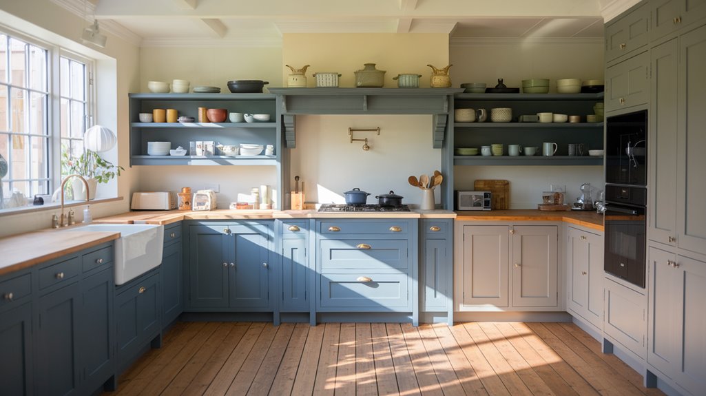
Dibber: Bringing Nature's Tranquility to Kitchen Cabinetry
Dibber's soft, mossy green brings an earthy elegance to your kitchen cabinets, balancing brown undertones that complement both modern and traditional design sensibilities. You'll find this grounding shade particularly valuable in north-facing kitchens, where its rich pigmentation helps counteract cooler light conditions while maintaining a serene atmosphere. When paired with lighter neutrals like Slipper Satin or Off White, your Dibber cabinetry creates a sophisticated connection to nature that transforms the heart of your home into a tranquil culinary haven.
Earthy Cabinet Elegance
The rich, mossy embrace of Dibber represents one of the most sophisticated colour choices for kitchen cabinetry in 2025. This nuanced shade expertly balances green tones with earthy undertones, creating a space that feels both grounded and invigorating. You'll find it remarkably adaptable to your home's lighting conditions—it maintains depth in north-facing kitchens while developing richness in south-facing spaces.
For a cohesive palette, pair Dibber with warm earthy terracotta shades like Stirabout, or complement it with neutrals such as Slipper Satin. The colour's natural inspiration—garden tools—connects your kitchen to the outdoors, fostering a tranquil atmosphere where cooking becomes meditative. As you repaint your cabinets in this verdant hue, you're not just updating surfaces but creating a sanctuary that celebrates nature's calming influence.
North-facing Kitchen Solutions
North-facing kitchens often present unique challenges with their cooler, bluer light profiles that can leave spaces feeling stark and uninviting. Enter Dibber, Farrow & Ball's 2025 collection standout—a soft, mossy green specifically designed to harmonise with northern exposures.
This earthy blend of green and brown transforms your cabinetry into a focal point that radiates warmth despite limited natural light. You'll find Dibber's adaptable character enhances both contemporary and traditional kitchen styles, creating a serene, rejuvenating atmosphere where you'll want to linger.
For maximum impact, pair Dibber with Off-White or Stirabout for elegant contrast that amplifies the kitchen's welcoming ambiance. The shade's rich undertones complement various materials—from wooden worktops to stone splashbacks—reinforcing your connection to nature while solving the north-facing conundrum with sophisticated ease.
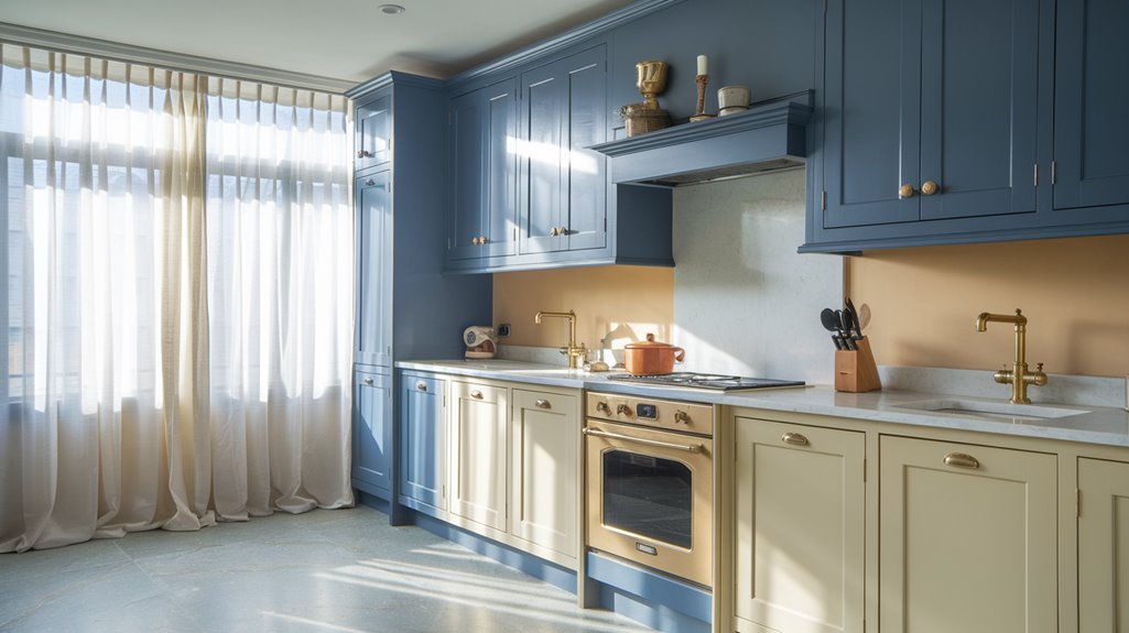
Douter: Creating Dramatic Depth in Contemporary Kitchens
Douter's moody grey-green shade transforms your kitchen cabinets with dramatic depth, creating a sophisticated culinary ambience that reflects contemporary elegance. You'll find the tarnished brass-inspired tone particularly striking when paired with warm brass or copper hardware, which accentuates the colour's distinctive character. When you incorporate this Farrow & Ball shade into your kitchen design, consider how natural and artificial lighting will interact with its complex undertones, revealing either its rich depth in southern exposures or its smokier qualities in north-facing spaces.
Moody Culinary Ambience
While transforming your kitchen cabinets, consider embracing Farrow & Ball's newest statement shade, Douter—a smoky grey-green that infuses contemporary culinary spaces with sophisticated drama. This tarnished brass-inspired hue from the 2025 collection creates exceptional depth, particularly in north-facing kitchens where its moody tones truly shine.
You'll find Douter's versatility impressive as it pairs effortlessly with warm neutrals, creating either a restful retreat or a striking focal point depending on your design vision. For a balanced aesthetic, complement this rich tone with lighter shades like School House White or Scallop. This approach accentuates the cabinetry while maintaining a cohesive look throughout your space.
As kitchens increasingly embrace deeper, more dramatic palettes for 2025, Douter offers you both timeless elegance and contemporary appeal in one sophisticated choice.
Brass Hardware Pairings
To maximise the impact of Douter's rich grey-green tones, pairing this sophisticated shade with brass hardware creates a stunning visual dialogue in contemporary kitchens. This moody grey-green colour, inspired by tarnished brass itself, naturally enhances metallic accents while adding dramatic depth to your culinary space.
When you apply Douter to cabinetry, consider installing brass knobs and pulls to achieve a luxurious contrast that elevates the entire design. The warmth of brass against the smoky undertones works beautifully in both north- and south-facing kitchens—appearing rich and inviting regardless of light exposure.
For a balanced aesthetic, complement your Douter cabinets with warm neutrals like Off White or earthy Stirabout on surrounding walls. This thoughtful combination allows the brass-and-Douter partnership to become the sophisticated focal point in your newly repainted kitchen.
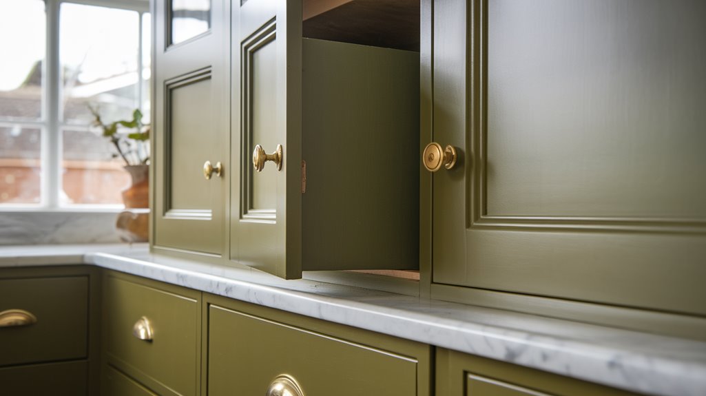
Reduced Green: Earth-Inspired Elegance for Cabinet Transformations
When seeking a transformative colour that brings both depth and tranquility to your kitchen space, Reduced Green emerges as a standout choice for cabinet repainting. This deep, earthy tone from Farrow & Ball's 2025 collection balances brown undertones with rich green, creating an inviting atmosphere that works beautifully in kitchens of any orientation.
| Light Conditions | Colour Impact | Pairing Suggestions |
|---|---|---|
| North-facing | Balances muted tones | Old White for contrast |
| South-facing | Enhances richness | French Gray for harmony |
| West-facing | Deepens at sunset | Templeton Pink for warmth |
| East-facing | Softens morning light | Natural wood accents |
| Artificial light | Maintains cosy feel | Brass hardware complements |
You'll find this versatile shade grounds your kitchen design while reflecting current trends toward serene, nature-inspired aesthetics—perfect for creating a space that feels both contemporary and timeless.
Sap Green: Vibrant Olive Tones for Statement Kitchens
Stepping from Reduced Green's earthy subtlety, Sap Green offers a bolder expression of nature-inspired colour for your kitchen cabinets. This vibrant olive green from Farrow & Ball's 2025 collection strikes an exquisite balance between energy and sophistication, transforming ordinary cabinetry into statement pieces.
You'll notice how Sap Green adapts beautifully to your kitchen's lighting conditions—appearing fresh and lively in south-facing spaces while developing deeper, richer tones in northern light. For maximum impact, pair with crisp whites like Wevet or Sizing to create striking contrast and visual depth.
The colour's earthy undertones work exceptionally well with natural materials, infusing your kitchen with warmth and invitation. For a cohesive design scheme, consider complementary Farrow & Ball shades such as Pink Ground or Bancha to create a layered, sophisticated palette throughout your space.
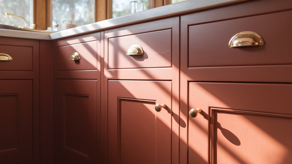
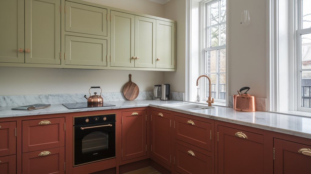
Etruscan Red: Sophisticated Warmth for Heritage Kitchen Designs
Etruscan Red, evoking the ancient artistry of Etruscan civilisation, brings heritage-inspired elegance to your kitchen cabinets with its sophisticated brown-based red tones. You'll notice how this refined hue from Farrow & Ball's 2025 collection transforms dramatically when bathed in candlelight, enhancing the intimate atmosphere of evening gatherings around your kitchen island or dining area. When planning your cabinet repainting project, consider how Etruscan Red's warm depth creates a timeless foundation that honours traditional craftsmanship while maintaining relevance in contemporary design.
Ancient-Inspired Elegance
Drawing inspiration from ancient Italian civilisations, Etruscan Red delivers a sophisticated warmth that transforms ordinary kitchen cabinets into statements of heritage elegance. You'll notice how this deep, brown-based red creates an inviting atmosphere that's particularly enchanting when illuminated by candlelight during evening gatherings.
For your heritage kitchen, consider pairing Etruscan Red cabinetry with lighter tones like Dimity or Oxford Stone to either balance its boldness or create dramatic contrasts. The versatility of this shade adapts beautifully to varying light exposures—north-facing rooms enhance its rich depth, while southern exposure brings out its earthy undertones.
Beyond cabinets, you can incorporate this timeless hue on accent walls or trim for a cohesive design. The result is a kitchen that honours historical aesthetics while maintaining contemporary sophistication.
Candlelit Glow Enhancer
When evening descends, Etruscan Red truly comes into its own, transforming your kitchen into a sanctuary of warmth and sophistication. This deep, brown-based red creates a candlelit glow that makes your heritage kitchen feel instantly more inviting and intimate.
| Etruscan Red Pairings | Effect in Your Kitchen |
|---|---|
| Dimity | Creates elegant contrast while maintaining warmth |
| Oxford Stone | Provides classic balance with earthy undertones |
| Under Natural Light | Reveals rich depth and subtle variations |
| Under Evening Lighting | Enhances the candlelit glow effect |
| On Cabinetry | Serves as a sophisticated focal point |
You'll find this shade particularly effective in dining areas where its richness shines regardless of lighting conditions. For a timeless look that feels both cozy and refined, consider Etruscan Red as your statement colour choice.
Naperon: Terracotta Richness for Mediterranean-Inspired Cabinets
Naperon, a sumptuous terracotta shade from Farrow & Ball's 2025 collection, brings Mediterranean warmth directly to your kitchen cabinetry. This rich, earthy tone evokes comfort and nostalgia while establishing a grounded aesthetic that's perfectly on-trend for modern kitchens seeking character and depth.
You'll find Naperon particularly transformative in north-facing kitchens, where its warm undertones create a cosy, inviting atmosphere that counteracts cooler light. In south-facing spaces, the Mediterranean influence shines even brighter, displaying the full richness of this sophisticated terracotta.
For a harmonious palette, pair your Naperon cabinets with Lime White or Lichen for a natural aesthetic, or combine with Red Earth for a warm, tonal approach that celebrates earthy sophistication. This statement colour delivers both timeless appeal and contemporary flair to your kitchen renovation.
Marmelo: Spiced Orange Accents for Kitchen Focal Points
A vibrant addition to Farrow & Ball's 2025 collection, Marmelo captures the warm essence of marmalade in a sophisticated burnt orange hue that transforms kitchen spaces with its spiced warmth. You'll find this shade particularly effective for creating striking focal points in your kitchen, whether applied to a kitchen island or lower cabinetry.
Pair Marmelo with lighter tones like Stirabout or Wimborne White to balance its intensity while maintaining a warm, inviting atmosphere. This thoughtful combination allows the orange accents to shine without overwhelming the space.
The colour's rich undertones complement natural materials beautifully, enhancing your kitchen's cosy ambiance. By incorporating Marmelo, you're celebrating the "extraordinary ordinary" - turning everyday cooking spaces into personalised sanctuaries filled with character and warmth.
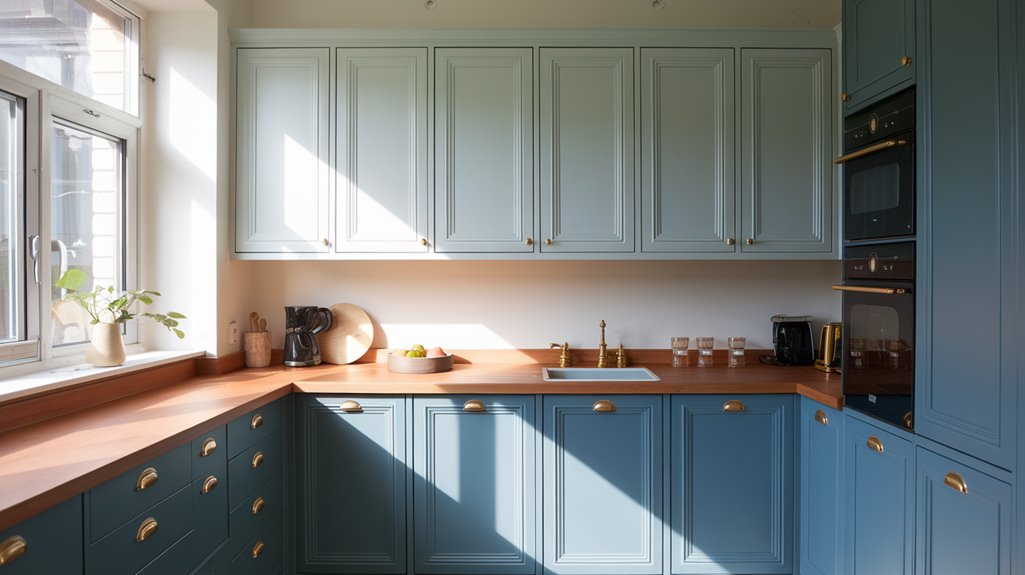
Kakelugn: Scandinavian Blue Serenity for Modern Kitchens
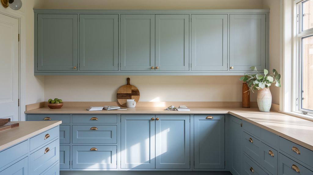
While Marmelo offers warmth and vibrancy, Kakelugn presents an entirely different mood for your kitchen transformation. This light blue shade draws inspiration from Swedish tile stoves, delivering serene Scandinavian simplicity to contemporary spaces.
You'll find Kakelugn adapts beautifully to various lighting conditions—brightening north-facing kitchens while maintaining its composed character in sun-drenched areas. For a harmonious palette, pair it with Wimborne White for trim, Oval Room Blue for accents, or Sap Green for complementary depth.
Consider applying Kakelugn to your cabinetry or as an accent wall to establish a tranquil foundation for your kitchen design. Its versatility allows it to coordinate effortlessly with different materials and fixtures while embodying the Scandinavian principles of calm functionality. This revitalising blue creates an inviting atmosphere that balances modern aesthetics with timeless appeal.
Pairing Cabinet Colours With Complementary Wall Treatments
Creating a harmonious relationship between your cabinet colour and wall treatment establishes the foundation for a cohesive kitchen design. Farrow & Ball's new colours offer sophisticated pairings that elevate your space instantly. Consider vibrant Sap Green cabinets against soft Wimborne White walls for fresh elegance, or create drama with deep Douter cabinets complemented by Off White surroundings.
For warmth, Naperon cabinets paired with Joa's White ceilings bring earthy richness while maintaining brightness. The striking Etruscan Red makes a bold statement when balanced with subtle Dimity walls, creating visual interest without overwhelming the space. Embracing 2025's grounding aesthetic, Dibber's mossy green cabinets find their perfect match in sandy Jitney wall treatments, delivering serene natural harmony. These thoughtful combinations guarantee your repainted kitchen feels intentionally designed rather than simply refreshed.
Colour Psychology: How Cabinet Hues Affect Kitchen Ambiance
Beyond aesthetic appeal, the colours you select for kitchen cabinets fundamentally shape your emotional experience within the space. Colour psychology reveals how warm tones like Naperon create inviting atmospheres that nurture social connections, while cool Douter promotes tranquility and focused meal preparation.
You'll find that vibrant Etruscan Red energises your kitchen, stimulating both appetite and creativity—perfect for homes where the kitchen serves as a central gathering place. Alternatively, earthy neutrals such as Dibber establish a grounded ambiance that harmonises beautifully with natural wood elements.
Consider how certain hues evoke nostalgia and comfort; Scallop, for instance, connects with cherished memories, enhancing your daily kitchen experience. The ambiance created by your cabinet colour choice influences not just how your kitchen looks, but how you feel within this essential living space.
Light Considerations: Choosing Colours Based on Kitchen Orientation
The natural light streaming into your kitchen fundamentally transforms how paint colours appear throughout the day, making your kitchen's orientation a crucial factor when selecting cabinet finishes. Different exposures create varying light conditions that can either enhance or diminish your chosen palette.
| Kitchen Orientation | Recommended Colours | Light Effect |
|---|---|---|
| North-Facing | Naperon, Scallop | Warmer tones counteract cool light, creating an inviting atmosphere |
| South-Facing | Dibber, Off-White | Cooler shades balance abundant natural light for a fresh feel |
| East/West-Facing | Reduced Green (east), Douter (west) | East: Earthy tones highlight morning warmth; West: Deeper colours enrich evening ambiance |
When you're selecting your cabinet colour name, remember that paint can appear dramatically different throughout the day. Pairing complementary shades like Scallop with Off-White maintains visual balance regardless of shifting light conditions.
Two-Tone Cabinet Strategies Using Farrow & Ball's 2025 Palette
Consider flipping the traditional approach by making your main cabinets the statement piece with Etruscan Red or Naperon, whilst keeping your island in neutral Off-White or Wevet for balance. This bold-neutral strategy creates a focal point with your primary cabinetry while allowing the island to serve as a visual resting place in your kitchen's composition. You'll achieve a design that feels both deliberately curated and professionally balanced, particularly effective in larger kitchens where the island serves as a central gathering point.
Bold Main Cabinets
Daring and distinctive, bold main cabinets anchor your kitchen with dramatic flair while setting the tone for your entire culinary space. Farrow & Ball's 2025 palette offers sophisticated options for those ready to embrace statement-making hues.
Choosing the right bold cabinet colour transforms your kitchen instantly:
- Etruscan Red delivers rich, earthy warmth that creates depth—pair with Scallop for a striking two-tone effect that enhances brightness
- Reduced Green grounds your space with sophisticated elegance and combines beautifully with lighter neutrals for perfect balance
- Douter's smoky grey-green adds dramatic impact when contrasted with crisp Wimborne White for timeless modernity
- Marmelo's mellow burnt orange brings vibrant energy while maintaining harmony when complemented by softer Jitney
These bold choices create kitchens with personality that you'll enjoy for years to come.
Neutral Island Accents
Creating visual relief in busy kitchens, neutral island accents serve as sophisticated anchors while allowing your bold main cabinets to shine. When your perimeter cabinets feature deeper tones like Douter or Reduced Green, consider Wimborne White or Sizing for your island to establish a calming counterpoint that enhances spatial perception.
For a reverse approach, accent islands in earthy Naperon provide cheerful contrast against cooler Kakelugn walls, creating depth without overwhelming the space. The understated elegance of Jitney on an island can beautifully balance the energy of Sap Green cabinetry elsewhere.
Remember that neutral tones don't mean lifeless—Farrow & Ball's 2025 palette offers sophisticated neutrals like Scallop that carry subtle undertones, adding dimension to your kitchen while maintaining a cohesive, thoughtfully designed aesthetic.
Island Focus: Creating Statement Pieces With Bold Colour Choices
The kitchen island serves as the perfect canvas for bold colour experimentation, transforming an ordinary workspace into a fascinating statement piece. When you're ready to make your island the star of your kitchen, consider Farrow & Ball's striking palette for 2025.
- Preference Red - This vibrant choice creates an energising focal point that instantly draws the eye while pairing beautifully with neutral surroundings
- Hague Blue - This deep, sophisticated hue adds remarkable depth when contrasted against lighter cabinetry or natural wood elements
- Naperon - A warm terracotta hue that brings Mediterranean warmth and creates an inviting atmosphere
- Dibber or Douter - These moody greens establish a connection to nature while maintaining contemporary elegance
For maximum impact, balance your bold colour choices with complementary neutral tones throughout the rest of your kitchen space.
Small Kitchen Transformations With Strategic Colour Application
You'll find that strategic colour application can dramatically transform your small kitchen, making it feel spacious despite its limited footprint. Lighter neutral shades like Scallop or Kakelugn create an airy foundation, reflecting natural light to visually expand your cooking space. For visual interest without overwhelming the area, consider incorporating bold accent zones using vibrant tones like Etruscan Red on select cabinets or a compact island.
Space-Expanding Neutrals
Smart homeowners understand that small kitchens don't necessarily require small design ambitions. Space-expanding neutrals from Farrow & Ball's 2025 palette can transform your compact kitchen into an airy sanctuary. Light Grey and soft neutral tones like Scallop paired with Wimborne White create an optical illusion of spaciousness while maintaining sophistication.
To maximise your small kitchen's potential:
- Apply Scallop to cabinetry to establish an open, inviting atmosphere
- Introduce earthy Jitney or Reduced Green for warmth without visual heaviness
- Contrast cabinet colours with crisp Wimborne White trim to reflect natural light
- Test true-to-colour samples in your specific space before committing
These strategic neutral choices guarantee your small kitchen feels expansive without sacrificing character—proving that thoughtful colour selection can completely reimagine the perceived dimensions of your cooking space.
Bold Accent Zones
Strategic splashes of colour can utterly transform even the smallest kitchen spaces when applied with intention and purpose. When creating bold accent zones, consider Farrow & Ball's Etruscan Red for cabinetry, offering a deep earthy glow that enhances warmth while establishing striking focal points.
| Colour Choice | Application Area | Effect | Pairing Suggestion | Atmosphere |
|---|---|---|---|---|
| Etruscan Red | Upper cabinetry | Warmth | Wimborne White | Inviting |
| Douter | Lower cabinets | Depth | Lighter walls | Intimate |
| Naperon | Island | Richness | Scallop | Balanced |
| Sap Green | Trim/shelving | Energy | Natural materials | Elegant |
| Marmelo | Accent wall | Vibrancy | Neutral tones | Cozy |
You'll find these strategic colour applications particularly effective in dining areas where the concentrated visual impact creates a distinct sense of place without overwhelming your limited kitchen footprint.
Open-Concept Considerations for Cabinet Colour Selection
When designing an open-concept kitchen, careful consideration of cabinet colour selection becomes paramount as these choices will influence the visual flow between connected living spaces. Farrow & Ball's muted greens like Dibber and Reduced Green offer seamless connections while maintaining a calming atmosphere throughout your home.
For open-concept layouts, consider these strategic colour approaches:
- Lighter shades - Scallop and Kakelugn enhance natural light flow and create spaciousness
- Dramatic accents - Hague Blue or Douter add depth when balanced with lighter elements
- Complementary pairings - Naperon with Wimborne White creates visual interest while maintaining cohesion
- Light-responsive options - South-facing kitchens benefit from Sap Green's fresh vibrance
Your cabinet colour selection should create harmony between spaces while reflecting your personal style and considering the unique lighting conditions of your home.
Maintaining Colour Integrity: Finishes and Protective Treatments
Preserving the authentic beauty of Farrow & Ball colours on your kitchen cabinets requires three essential protective strategies: selecting appropriate finishes, applying protective treatments, and implementing regular maintenance routines.
For finishes, consider Modern Emulsion for a sophisticated matte appearance or Estate Eggshell for durability with subtle sheen. Before application, test your chosen finish on a small area to verify compatibility with your cabinet material. Always use a primer designed specifically for your selected finish—this prevents underlying surfaces from affecting the final colour and improves adhesion.
To extend your cabinets' lifespan, apply protective treatments such as clear sealers or topcoats, particularly in high-traffic areas prone to wear. Maintain your investment by cleaning surfaces regularly with gentle, non-abrasive products that won't damage the distinctive Farrow & Ball pigments.
Budget-Friendly Approaches to Cabinet Repainting Projects
Achieving a stunning cabinet transformation needn't strain your finances when you approach the project with resourcefulness and planning. Opt for Farrow & Ball's Modern Emulsion starting at £52.50 for a premium finish without the premium cost.
Save on style without sacrificing quality—smart planning transforms cabinets with premium finishes at accessible price points.
Before committing to a full repaint, consider these budget-conscious strategies:
- Purchase 100ml sample pots in enchanting shades like Scallop or Naperon to test colours in your space
- Book complimentary colour consultations with Farrow & Ball specialists for expert guidance
- Tackle the painting yourself using The Chromologist's step-by-step guides to save on labour costs
- Create a cohesive kitchen by pairing complementary shades from the 2025 collection, such as Dibber with Slipper Satin
Frequently Asked Questions
What Colour to Paint a Kitchen in 2025?
For 2025, you'll find Farrow & Ball's Etruscan Red or Naperon perfect for bold statements, whilst soft greens like Dibber create serenity. Don't overlook warm Scallop or dramatic Douter for sophisticated refinement.
What Are the Paint Colours for 2025 Farrow and Ball?
Like a painter's fresh palette, Farrow & Ball's 2025 collection features twelve new hues including Scallop, Marmelo, Kakelugn, Naperon, Etruscan Red, Dibber, Douter, and Reduced Green, all offering nuanced depth for your spaces.
What Is the Most Popular Farrow and Ball Colour for Kitchen Cabinets?
For 2025's most popular Farrow & Ball kitchen cabinet colour, you'll find Scallop leading the way. This soft, nostalgic pink offers exceptional warmth and adapts beautifully across different lighting conditions throughout your day.
Can You Use Farrow and Ball Paint to Paint Kitchen Cupboards?
Like a butterfly's transformation, you'll find Farrow and Ball's Estate Eggshell perfect for kitchen cupboards. It's durable, wipe-clean, and offers exquisite depth of colour with proper preparation and priming.
Conclusion
You'll find Farrow & Ball's 2025 palette both rooted in tradition yet boldly forward-looking. Whilst Scallop whispers of yesterday's comfort, Douter commands attention with contemporary confidence. Your kitchen cabinets needn't require a complete renovation when these transformative hues await your brush. Remember, the perfect finish protects your investment as it elevates your aesthetic—creating spaces where culinary creativity and refined design sensibility seamlessly coexist.